
General Information
When accessing Squarespace’s Help sections, be sure to follow instructions specific to version 7.0, and the Bedford template when applicable. Keep in mind that the current hosting plan is a Personal / Basic level, so some options and custom code will not be accessible or possible to implement. If needed, it is easy to upgrade to a business hosting plan level and above.
Quick links are included below. You can always access Help from the left-hand tool menu’s Home section; it is the last item in the list.
template-specific information — Bedford (version 7.0)
Bedford Template | ReadMe
Online information for Bedford Template — https://support.squarespace.com/hc/en-us/articles/205825968
Covered in these instructions are instructions for Banner slideshow and video banners in the Bedford template.
General Squarespace Help
Follow instructions for version 7.0
General Squarespace Help — https://support.squarespace.com/hc/en-us/categories/200352188-Knowledge-Base
Editing — Page and Content Basics — https://support.squarespace.com/hc/en-us/articles/206795137
Squarespace Blog functionality is used for the Episodes section.
Blogging with Squarespace — https://support.squarespace.com/hc/en-us/articles/206543727
Tag Cloud Blocks — https://support.squarespace.com/hc/en-us/articles/205814218-Tag-Cloud-Blocks
Embedding videos — https://support.squarespace.com/hc/en-us/articles/206542397-Adding-videos-to-your-site
Using audio blocks — https://support.squarespace.com/hc/en-us/articles/206543197-Audio-Blocks
V 7.0 Gallery Pages — https://support.squarespace.com/hc/en-us/articles/206543047
Gallery Blocks — https://support.squarespace.com/hc/en-us/articles/206543407
Summary Blocks — https://support.squarespace.com/hc/en-us/articles/206543337
Restoring deleted pages and blog posts — https://support.squarespace.com/hc/en-us/articles/205826038
This Is a First-level Heading (H1)
Use this for page titles and section titles within a page
Linked H1
Linking an H1 will change its color — useful when the heading can actually link to site content (link to a page or blog post or . . .)
This Is a Second-level Heading (H2)
Use this for decorative splash when needed, such as “The Happy Warrior” on the home page .
Linked H2
A linked H2 will also change to the site’s link color.
This Is a Third-level Heading (H3)
Linked H3
This is a workhorse heading. It will change color with linking. It can also take on additional emphasis by making it bold (Third-level above.)
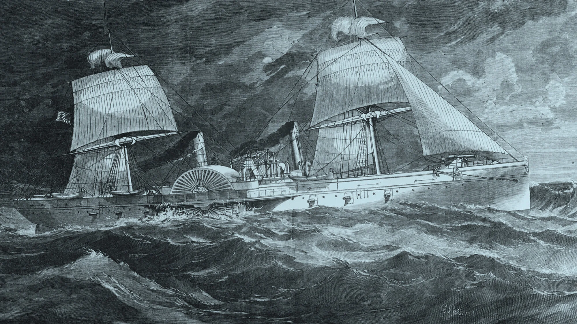
text block with a photo aligned to the side
Lorem ipsum dolor sit amet, consectetur adipiscing elit. Aliquam quis mi at erat luctus sagittis rutrum et arcu. Quisque vel risus placerat, porttitor dolor ac, dictum massa. Mauris id tellus ac ante auctor tristique. Etiam sodales tellus at fermentum dapibus. Vestibulum diam orci, ultricies semper venenatis ac, efficitur id justo. Duis ac est quam. Sed mi mauris, malesuada nec consectetur a, aliquet ut ante. Praesent sollicitudin suscipit mi, et iaculis ante consequat eu. Quisque non est nisl. Etiam convallis, nibh eget pharetra dignissim, velit dolor venenatis arcu, at dignissim risus dolor eget elit. Etiam pharetra nisl erat, sed tincidunt odio mattis ac. Proin malesuada nunc vel consectetur eleifend. Sed tristique suscipit purus nec bibendum.
Vivamus sit amet lectus erat. Morbi eget viverra elit. Integer nec tortor et sapien euismod auctor. Quisque volutpat vitae urna eget placerat. Maecenas id lacus ac dolor ornare gravida. Curabitur cursus iaculis orci. Morbi sodales aliquam enim, non sodales elit elementum commodo. Proin porta, velit eget porta iaculis, odio mauris condimentum risus, vel faucibus diam lacus sollicitudin massa. Vivamus eget pretium sem. Proin auctor ornare ligula, a facilisis elit maximus vitae.

An image caption looks like this. These also function as ALT text for SEO and accessibility purposes. If captions are hidden, they mostly function as the ALT text, which is quite useful for SEO purposes.
“Whatever it is, the way you tell your story online can make all the difference.”
This is what a gallery block looks like. It displays the content of the specified gallery. This one is showing the Book Cover gallery. These function similarly to summary blocks which will aggregate blog posts, etc.


Copy & Paste
— em dash (between phrases)
– en dash (between numbers as in 1865–1910)
■ medium square dingbat used throughout the site
⟶ arrow used for text links throughout the site (e.g., back to top ⟶ )
The “back to top” is simply a text link to the same page. What it does is reload the page, which looks like a jump to the top. These are set up as flush right to distinguish them from the lengthy copy that usually precedes this kind of a link.
Buttons can vary in size. The SMALL button is in use throughout the site. If you need more oompf for whatever reason, use one of the larger sizes.
The Newsletter block looks like this. Setting up the data collection and auto-reply is described here: https://support.squarespace.com/hc/en-us/articles/205826068

Image | Card format
Setting the image Design to ‘Card’ will display the caption to the side of the image.

Image | Overlap
Setting an image’s Design to ‘Overlap’ will display the caption’s title in an overlapping banner.

Image | Poster
Poster format for images will display full-width images, much like a banner.

Image | Collage
Selecting Image ‘Collage’ results in an overlapping block of color showcasing the image title and caption.
Play Area!
Use this area to play around with formatting without worrying about what will happen on a public-facing page. Start adding “blocks” and have fun. When you have something you like, copy and paste it into place of the page you’d like to update.